


 of My Google Ads?")


How many times have you finished a project, only to look back and then say, “Man, if only I knew the things I know now and I could go back in time and redo it over again.” I know I have.
It happens to all of us; we get excited about a project. You make jokes with the client about the current website, contracts are signed and you start mocking up prototypes. On small projects you might get away with this. On big projects, changes and scope-creep will start sneaking up on you as soon as you do your first presentation. If you ever do end up launching your project, it will most likely resemble the monstrosity you were hired to fix. It might only just look a little better.
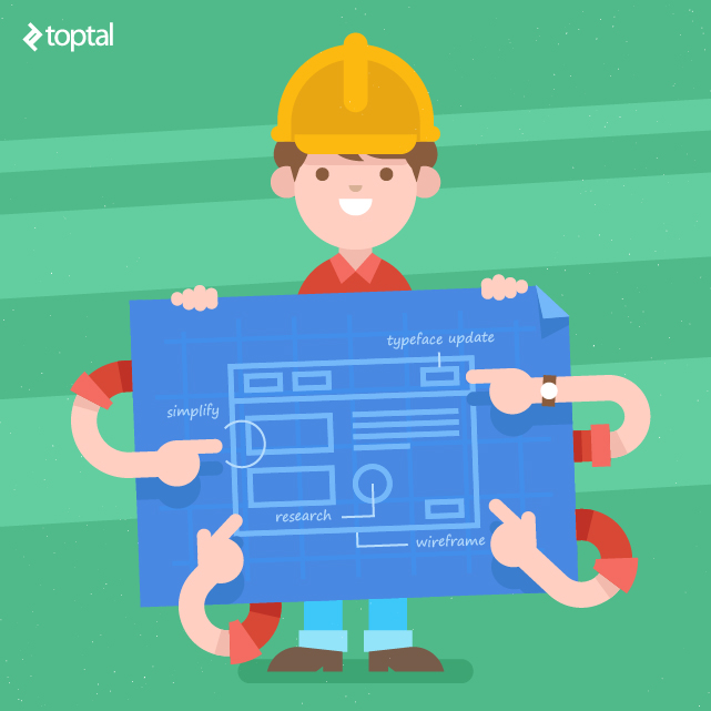
Good design and user experience begins not with a pretty mockup, or even layout, but with a concept foundation that focuses on company goals. And those goals are not “let’s make a prettier and simpler website.” Since you are responsible for User Experience (UX) and User Interface (UI), it’s your job to make sure users have the best experience through the interface that you design. To do that, everything has to be thoroughly planned out from the beginning.
Initial Website Design Research
After the initial research of the client’s field, as well as their competition, I inspect what we have to start with. I have a separate cost just for this analysis (it’s then included in final quote) before I ever quote a project. This avoids ambiguous high quotes with hope that it will cover whatever is discovered later.
Today my client is a non-profit organization in the archaeology field. They explore and protect archaeological sites in the Southwestern US. Their current website is a monumental achievement in disorganization. Imagine mountains and mountains of unorganized, hoarded content inside an ancient CMS portal. Thus, the first step is to organize what we have.
Step 1: Familiarize Ourselves with the Content
When you need to build a new house you don’t tear down the old one without first taking out things that are inside. Our first goal was to go inside all the rooms and take out all the content. In design speak, we needed to go inside and figure out what content deserves to be a unique post type and what pages are static.

We can then come up with a strategy on how to best organize this. The reason we are not checking to see what should stay and what should be removed first is because in the real world this can’t be done right away. There are different people responsible for different parts of the site and there is too much unsorted content. Our best bet is to classify it first.
I usually start with the main navigation and go page by page. This way, I have a site blueprint before the first meeting. This was not the case with this project, most links were not accessible through top navigation and where hidden within the content (you’d be in for a treat if you just quoted the project based off their navigation). Only by talking to different people on the client’s team was I able to get a better picture.
Finally, I had a brainstorming session with the client, where I asked them to identify their current website focus, workflow, site content and features. We then came up with the following core types (some are new and some were already in place):
The most difficult part was that the majority of links were not accessible through top navigation and were hidden within the content. Only by talking to different people on the client’s team was I able to get the whole picture.
Step 2: Create focus, simplify and organize
Now that I had all of the content out of the house and placed it in labeled boxes, it was time to come up with the blueprint for a house that will showcase our content in its best form. Before we get to that though, we need to create focus.
According to the client, its users visit this archaeology website for research information about its projects, learn about ongoing events, as well as read its monthly magazine. Even though these content areas are where visitors end up, it’s not what the website revolves around; in order to find the focus, you have to look at the organization’s core.
I pinpointed that “location” is at the heart of all this content. Without location there would be no archaeological sites, ruins, museums or exhibits. At its core, everything in archaeology relates back to a location.
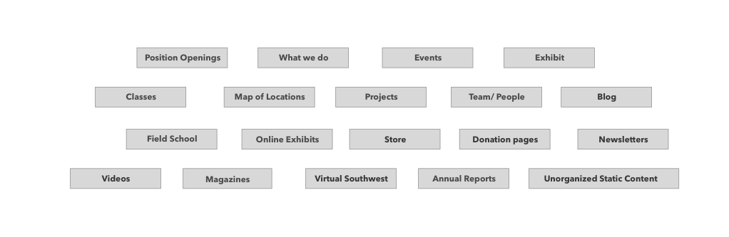
Now that we have our focus it’s time to simplify and organize. Next, I further broke down the content into things that were not related to locations, such as team pages, annual reports, and so on. After a little tidying up we ended up with this rough map:

As you can see now we have two core areas: “Things to Do” and “Locations.” “Things to Do” covers everything you can do in the organization while “Locations” focuses on content that’s related to a specific location. The idea is that an average user might not know the name of the video or a project but will likely know the location it relates to. For example, by going to a projects page, a visitor will find the desired project through its location.
Additionally, each color represents a unique post type. I realized that from an organizational perspective, events, exhibits, classes and online exhibits are all, essentially, events, just different kinds.
In the current site there was a static page for a magazine as well as a store page. I decided to eliminate the extra step of going to the store page and, instead, have a unique template for magazine store items. The rest is pretty straightforward: An About page to learn about the organization; a direct link to the store; a donate page (because those pages make money and need a place in the main nave), plus new pages for updates and a direct link to the store/donate. Those pages make money, so they deserve a place in the main navigation. We have created our organization blueprint, now it’s time to connect actual content to it.
Step 3: Looping in the Client
As you can see from the site map above, it only includes the page types but not the mapping of content. And, as you probably already know, most issues occur when the client starts adding content to their site. To avoid this, the client is looped in from the beginning. I created a Google doc that included the sitemap above and asked the client to map its current content to the new structure.
If something didn’t fit, we figured it out later. This is a critical step as it not only gets the client involved but it uncovers issues with structure before implementation begins. In this case, some of the site map menu items were changed, and since the client also had many different donation pages, it made sense to create a unique post type just for that.
Creating Visual Structure Through Wireframing
Now, it’s time to give all this a visual structure. To have the system function successfully, and to take the idea of “everything is related to location” correctly, I created a bidirectional relationship between post types.
The idea is this: When a visitor comes to this archeology website and picks the Grand Canyon, not only will she or he see information about that location, but they will also find projects, events, exhibits and anything else that the client marked as related to that location. Since the link is bidirectional, visitors will also get to the Grand Canyon from visiting a project page, too. So, I ended up with this:
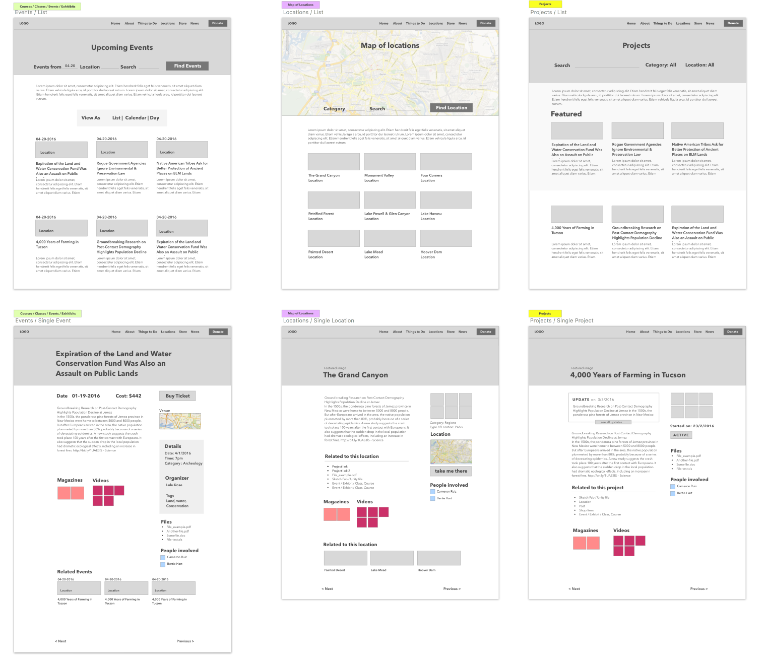
The locations index page showcases all locations with the most recent at the top. The search bar is the first thing the user sees when they get to the page. I envision that upon entrance the Google map will take up around 80 percent of the screen, so users can pick points on the map, then as they scroll or search the list grid will come into view.
On a single location page main body is on the left, since it’s the most important information and related meta information is secondary, so it’s on the right. When designing a layout, to achieve good composition you always want to have very distinct primary, secondary and third element blocks. This way your eye will follow from one to another instead of getting stuck on a page.
Therefore, in our layout, the user’s eyes will start with the header, then move to the content block, followed by the right sidebar. Each piece of related content is displayed in order of relevance and importance. If the user is reading about the Grand Canyon, for instance, it will likely be followed by photos and a map.
This is chiefly an educational site, so “Related to this location” comes next. Since the client doesn’t have much that’s uniquely associated with each location, I combined seldomly used related content into a single block under the body.
Placing magazine and video thumbs under related content adds additional visual elements and directs users to the “Buy” page. The page is completed by showing related locations since this entices users to further explore the site.
The next step is to continue this structure for other post types. Here are a few of them:

Now that I have a general model for the post types, I can focus on the home page. Just as with all UI, the first step is coming up with the goal for the home page. The client’s research showed that many users stumble upon the site without fully understanding what it is. Therefore, an introduction and welcoming text needs to be the first thing users see. The new, core focus revolves around locations and that should be the secondary block, followed by what’s going on at ArchaeologySouthwest.org (the current magazine, blog, events, newsletter and so on). Here is the iteration of the layout process:

With V1, I came up with a basic layout that resembles the original homepage. There is not much hierarchy; the first thing a user will see is the featured location and then he will get lost in the columns. With V2, I created a separate column that makes it easier for the eyes to follow. However, it can still be improved. This is where knowledge of the content plays a major role. I know that ArchaeologySouthwest.org doesn’t have more than two events going on at a time, so it doesn’t make sense to have many on the home page. In V3, I focused on the upcoming events so that if there will be more than two, the user can click a ”More” button and see the rest. I also put additional emphasis on the current magazine since it’s the client’s moneymaker. Users start at the top and using an F-pattern, move down. So now, the eye flow is Featured Location > Welcome > Magazine > Events > News.
Now that I have a visual wireframe and structure of the site it’s much easier to solidify features and how things will work. I have another meeting with client to go over actual functionality (which now comes to light) and flow of user interaction. I know there are still going to be tweaks in the end, but they will be tweaks and not entire process changes. Most importantly, there will be no surprises.
Website Design
Now comes the exciting part. Converting the wireframes to something that people will use and experience. Using this design, I wanted to reinforce the flow further by using brand colors and typography. The client’s style guide is as follows:

Start with Typography
Typography is the foundation of a good design, that’s why we figure it out early. Most of their identity uses Univers Condensed Light and Adobe Caslon font. There were no rules on when Adobe Caslon was to be used, but I noticed that it wasn’t used as often as Univers. I conducted a small font study to see what pairings create the best feel for a professional humble non-profit organization without looking too different from their current collateral.
Upon doing font comparisons, it’s clear that Adobe Caslon will work great as a title font, and Univers for subtitles. By having our main titles in sentence case gives the brand a more personal feel. Having it in all caps makes ArchaeologySouthwest.org feel too much like a corporate institution.

For main headings I’ll use Adobe Caslon, and use Univers Condensed Light for everything else to match their current branding collateral.
Creating the Look and Feel of the Website
I wanted to create a light and open experience for users who should feel that this nonprofit organization takes them seriously without being cold and corporate. Based on analytics data, the majority of visitors arrive from desktops (probably because most people visit the site for research) and therefore, my initial focus was on designing for desktop users. This turned out to be the final design.
When arriving from a desktop, I wanted users to see immediately the featured location, welcome text and the upcoming events followed by part of the magazine title. This way people see what the company is about, and what they are promoting before they have to scroll on most laptop devices. By using a soft shadow on the left column it gives it more focus and solidifies the hierarchy.
On mobile devices, the priorities are a little different; since users are accessing information on the go, the Events are more important so they are higher on the list. The complete layout ends up like this:

I updated the donation button in the footer to be more friendly by changing it into a sentence instead of a button.
Creating the Rest
I can then apply this design concept into our other layouts as well.
We know for certain that users come to the details page for two reasons: either they want to learn more about the landmark, or they already know about this location and are just looking for additional information (directions, phone numbers, and so on). Therefore it’s important to present both options right away so our users are not searching for it.

I decided to break out the details column out of content area to give it more weight as well as make the page more interesting. This helps to create a compositional hierarchy so when a user comes to the page they see the title first, followed by gallery images, and the meta details column. This ensures that they will notice additional meta information right away. A little bit extra padding the column keeps the eyes within it and makes it easier to skim down through information.
The client does not plan to have many videos and magazines related to each location, therefore we are only showcasing two items and if there is more they can click the link.
The Mobile view collapses as you would expect with the content wiping first, and then the meta information. I made the videos and magazines last on our mobile page since they are least important for mobile users. Other inner sections follow the same structure and wireframes to create a consistent flow and experience.
Looking back at the design process you can see that the majority of the time was spent organizing and planning. Whereas only 30 percent of the time was spent actually designing. Often when designers show their work, they are dishonest about how much time is spent on Google Docs organizing rather than doing pretty mockups. Thus, many other designers jump straight into mockups and end up with derailed projects and unhappy clients. There is no one way to plan, it just has to be done if you want to have a successful project. Let me know what your process is, and how it differs – I’m excited to see the workflows of others.
This article originally appeared on Toptal.