Marketers, Consumer Product developers & Sales Communities would agree that getting your customers’ captive attention and being able to influence their behavior, or decision making is probably the hardest thing to achieve in today’s world. Experts in Content Marketing or Sales Communication have highlighted the importance of ‘engaging your customers effectively’ to move them along a ‘conversion funnel’.
But how does this ‘engagement’ actually happen? What contributes to a perceptible and desired change in customer behavior? What does it take to get customers talking about your product with delight? We all know that changing behavior is not trivial. Changing consumer behavior requires getting them to take actions they don’t usually take, or are not expected to make unless they modify the basis of how they act. When a customer tries a new product or service that really doesn’t amount to ‘changed behavior’ only because a consumer may routinely try different products. That small aberration in ‘behavior’ could easily be reversed, or could evolve into a new behavior where the customer is not loyal to any brand.
Consumers Hate Change
“People hate change. They love consistency,” notes Chris Nodder in his book Evil by Design. “The posh name for this is ‘status quo bias’: the tendency to like things to stay relatively the same, and to perceive any change from the current situation as a loss. ‘Loss aversion’ leads people to overestimate potential losses from a change and underestimate the potential gains. They also tend to overvalue their current situation (the endowment effect).”
This is where Strategic Customer Experience can play a big role. Strategic Customer Experience combines knowledge from various disciplines such as Consumer Psychology, Cognitive Science, Data Analytics, Ergonomics etc to come up with the most optimized way to influence the customer choices for a given situation. Also in the recent years there have been a few postulations about ‘Experiential Models’ that result into sustained engagement and habit formation. But the most important means to achieve a real behavior change remains ‘positive emotion’ or ‘delight’ that can turn a customer into a promoter of a product by recommending it or talking about it to others.
How Consumer Delight Takes Place
There are few distinct patterns in how this ‘delight’ takes place in customers’ minds. But they primarily arise out of a situation, a particular point in their overall customer journey (e.g. purchase, upgrade or evaluation etc.) when they are in an emotionally vulnerable position.
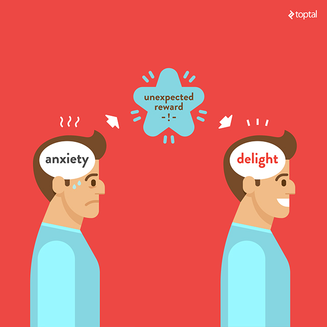
For example, imagine this scenario. A customer needs to cancel a flight booking, but it will incur a steep penalty since there is no cancellation window left. This induces anxiety. However, there is an unexpected resolution. The airline company informs the customer that the refund amount has been transferred to a wallet, and can be used for a booking in the future. As a result, the customer is relieved and raves about their experience on social media.
Nir Eyal, author of the book Hooked: How to Build Habit-Forming Products, hypothesizes that a product should be designed to facilitate a user’s need, but ultimately alleviate a symptom of a problem they have. Doing so will cause a product to be habit-forming. Habits can be good for users, and in turn good for business, because they:
- Create higher customer lifetime value
- Offer greater pricing flexibility
- Supercharge growth
- Increase loyalty
BJ Fogg, director, research and design at Stanford University where he founded the Persuasive Technology Lab, has a model showing the three elements required for any effective behavior change: Motivation, Triggers and Ability.
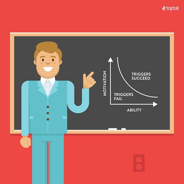
An integrated customer experience process within a successful customer focused organization should do all three well. Firstly, it should know when the customers are at an emotional high or low point (both could be substantial) and what behaviors do they exhibit that betray a problem or a root cause. Secondly, a sound design process takes in all the data and lays out an experience designed to provide effective triggers – ‘Call to Actions’ that communicate an outcome that would be ‘acceptable’ and ‘beneficial’ to them. Sometimes this process could be staggered. The real benefit due to the action that was taken may realize a bit late but none the less it acts as a reward and the expectation of the reward sustains the ‘engagement’. A reward that might get customers interested to invest more.
How Design Can ‘Hook’ Consumers
Eyal’s diagram for an approach called ‘Hook’, is an experience that connects the customer’s problem to a solution that intends to change a specific behavior.
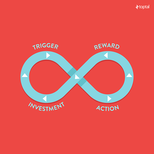
But there are important differences in their approach. Fogg’s behavioral model applies equally well to actions you want to motivate, but also actions you want to avoid encouraging. Eyal focuses on just one of these four quadrants—those actions that you want to turn into habits, and habits to addiction. Ubiquitous access to the web, mobile devices encroaching our personal spaces and transferring greater amounts of personal data at faster speeds than ever before, has created a more addictive world.
This is where the ‘Delight’ that results into a ‘Positive Emotion’ becomes important. Positive emotion can either reinforce or deter users from a specific behavior that results in a mutually beneficial consequence. Most ‘Customer Experience’ design efforts focus on providing an intuitive ability to perform a task well to the target customers. However, this approach takes a narrow view of the client’s real world that comprises of many adjacent emotions, attitudes, behaviors, values and belief systems.
Providing delight in a Customer Journey requires understanding multiple dimensions of the context and scenario in designing an experience that generates positive emotions at different points. Jared Spool in his article Pleasure, Flow, and Meaning – 3 Approaches to Designing for Delight, covers this in some details. Overall two principal methods differ based on how an organization plans to create a ‘space’ in the minds of its customers who are constantly enticed by the competitors with similar or better propositions:
Intentional Delight through Micro-interaction Design
Removing an obvious or known pain in the customers’ journey or making a complex task seemingly easier, are some ways to provide ‘intentional Delight’. Some companies who do it well also keep in mind that the ‘prize’ has to be ‘big’ for the intended return or outcome to be significant. Let’s look at an example. MailChimp, is an ideal balance of usefulness and delight. It fulfills a fairly technical niche, Managing Mass Mailer Campaigns, one so practical it could theoretically survive with a barebones interface. What makes MailChimp thrive is its smooth functionality wrapped in cheeky humor and visually friendly design. MailChimp transforms a dry task into an inviting experience.
Combining fun cartoons with tongue-in-cheek messages like “This is your moment of glory,” MailChimp softens the nervousness of sending your first email campaign. The actions and reactions of the interface feel less like an email marketing app and more like an empathetic instructor that understands you.
The humor and mascot are all part of the surface layer of delight. But when we dive deeper, we see that the conversational feedback and effortless task flow helps MailChimp connect with users on a more intangible level. The product instructs, entertains, and facilitates. As a result, even the most novice email marketer feels like a pro—and that’s a truly unforgettable experience.
Bottom line: never underestimate the “little things”. Micro-interactions are just not clever ways to keep the customer in good humor. They are ‘contained product moments’. Micro-interactions model can be categorized into triggers, rules, feedback, loops & modes. Triggers could be manual or system generated. Nest shows you the temperature when you approach the device; Instapaper app offers you a rotation lock if you accidentally rotate your device.
The good example of Rules is setting smart defaults with something you already know about the user. Waze suggests driving routes based on user behavior. Feedback is what helps users learn the Rules. The Temple Run game suggests ways to avoid falling and getting eaten up by the chasing beast.
Loops & modes provide a dimension (time, space etc.) of things over time. Spotify fades text for songs that have been added a long time ago.
Deeper Delight Through Meaning Making
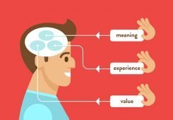
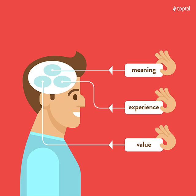
The phrase ‘meaningful experience’ has been widely used within the digital industry, however it is often only mentioned in relation to usability and artificial delight. Nathan Shedroff, one of the pioneers of experience design, describes it as “one that reaches beyond the person’s functional, emotional and identity needs. It answers the key question of ‘Does this fit into my world?’ or conversely ‘Can this be my world?’ And if businesses focus on the meaning, and work from the centre out, the questions about price, performance, triggers and design decisions would sort out themselves”. The deeper you anchor your brand into the user’s life, the more sustainable relationship you will have and this is where the future of marketing or commercial success lies.
The problem is that linear, or more specifically process oriented cultures like ours, the product development is viewed from a ‘prioritization’ model, where we start at the bottom and work our way up. Emotion is prioritized last, even though we may know it matters most.
Emotion is added as a superficial layer, or worse, the emotional element gets pushed to a later release to provide a branding make over. This approach makes delivering deeper level engagement hard because it separates the ‘emotional needs’ from the functional benefits of the product and therefore fails to create any ‘meaning’.
If you want to delight your customers, the real challenge is to be empathetic—put yourself in their shoes—and pay tremendous attention to the details at every step of the consumer’s journey. From the introductory communications, to the website, in the discovery/trial experience and on through the packaging, the purchase flow, and the post-sale interaction, messaging tone and voice, your view must be holistic. The insight, coming out of a deep empathy, leads you to discover the purpose, the ‘Why’ rather than ‘What’ in a product development ideation.
In his book, The Invisible Computer, Donald A. Norman notes: “I don’t want to use a computer. I don’t want to do word processing. I want to write a letter, or find out what the weather will be, or pay a bill, or play a game. I don’t want to use a computer, I want to accomplish something. I want to do something meaningful to me.”
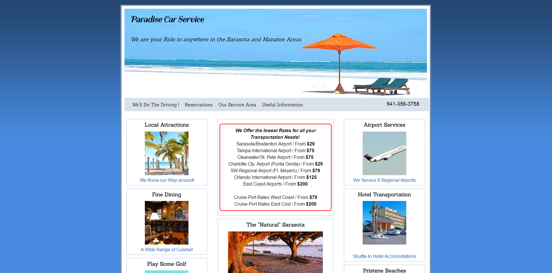
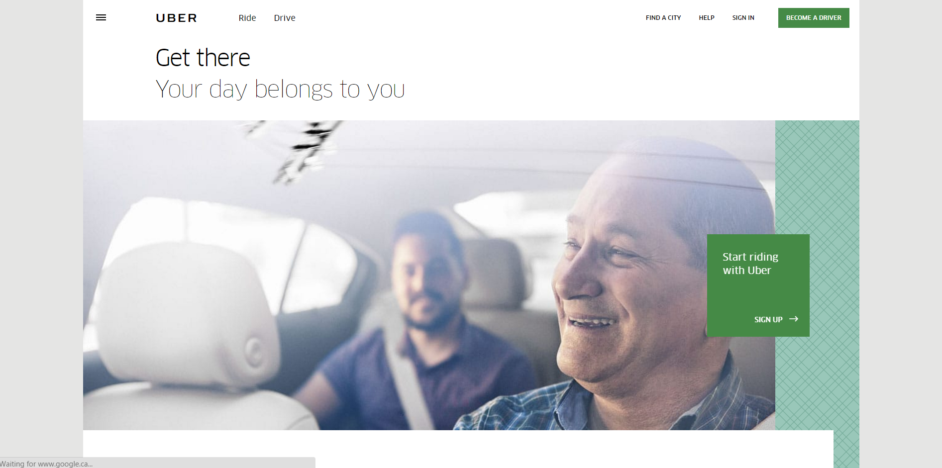
To understand this better, we could look at some existing examples around us. And comparing two products from a similar domain makes it even more pronounced. A simple home page comparison of two car ride providers looks distinctly different. It leaves no doubt in our mind why touching emotions and creating ‘meaning’ makes such a big difference.
In the first example below, the content just functionally states about chauffeur driven transport, the service or offering.
The latter however almost self explains how it connects with its customers instantly. The content focuses on communicating the real reason why customers look for a ride. It successfully conveys that an Uber ride relieves them of driving anxiety and lets them focus on what they plan to accomplish in the day. It puts the pain of driving before an important business meeting right at the center of the experience strategy.
So then how exactly do we frame this in our design process that evokes positive emotion or delight? The first step towards this is to really know who your customers or users are, and what really matters to them, what pain they are facing and most importantly what is the purpose in their lives that a product can fit in. This exercise alone produces deep insights and provide us a way to reframe the product offering or a proposed solution differently and allow us to identify the ‘emotional needs’ a customer needs to fulfill and how the ‘solution’ would fit in it the best way possible. What helps us drive towards an iterative definition of the ‘problem’ comes from these insights and a deep and full understanding of what people ‘say’, ‘do’ and ‘feel’. Asking questions and observation of behavior go hand in hand.
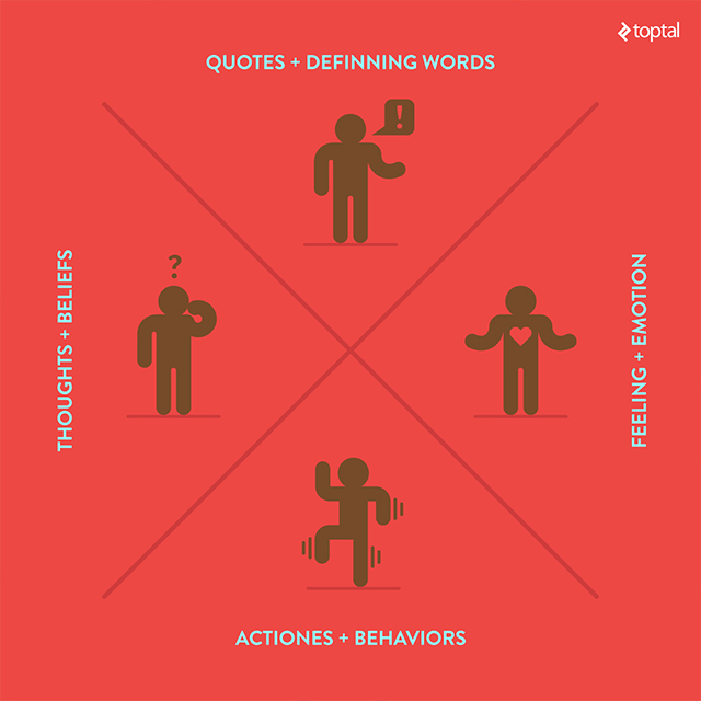
After customer immersion or context studies are completed for an identified customer segment for a specific value proposition. The data is used to model the customer’s context and clearly articulate the problem that needs a ‘solution’. This ideally should happen during the early exploration-conceptualization phase of the development process. A design tool called an ‘Empathy Map’ [image above] is used here that help designers and product owners identify unarticulated emotional nuances around a problem area. This discovery is then expressed in a clear problem statement that forms the basis of solution ideation process.
In the design process, the element of emotion needs to be addressed in a careful and systematic way. The steps below could be one way of successfully capturing emotion and working with it to a proposition of ‘delight’:
-
- Identify ‘Own’able moments: Detail analysis of the customer journey reveals several points when the customer is at an emotionally vulnerable point. He could be frustrated or anxious, elated or feeling in control. These moments need to be understood deeply. The overall design of the proposed experience should address these and create a ‘meaningful’ language around them.
- Convey the response to the emotions in appropriate place and time: An experience that responds to the customers emotionally can do it in three ways:
- Visceral: Appearance, Visual language, Tone or Voice
- Behavioral: How it works, behaves, or responds
- Reflective: How it is interpreted or understood
- Deliver Meaning as an Outcome: ‘Meaning’ in this context is a purpose fulfilled or an aspiration actualized. It is not a literal interaction metaphor. So it is better that we design for it and not with it. Meaning is more powerful than emotions and it transcends value.
- The process of ‘Meaning Making’ through creating delight driven design intervention is tedious, iterative and should be based on continuous experimentation. But even if you are not in a position to do long gestation before the all important ‘product launch’, think of staggering it as several ‘learning launches’ or early Alpha with a limited group of potential users. And work with the learning to move forward. Most organizations lose patience right at this spot for various reasons. But the key point is to sustain thru the learning cycles and improve. To really arrive in a ‘place’ where the outcome of the design process elevates the product positioning in a way that makes it click with the users emotionally and at the same time opens doors to significantly higher engagement or behavior change, requires thorough awareness, commitment and passion.
This post originally appeared on Toptal


