of My Google Ads?")


Converting visitors into leads is easier said than done.
Many companies utilize content marketing to send traffic to their sites, but these efforts are wasted at the conversion stage by not using landing pages to generate leads.
According to HubSpot, landing pages and similar inbound marketing strategies generate twice as many leads than non-inbound marketers.
Think of a landing page as your digital sales rep that gathers information from your users about marketing and sales to move them through any sort of desired action. Without a well designed landing page, websites are limited in their ability to turn visitors into leads.
There is no one right way of designing a landing page, as there are many different types of landing pages with different purposes. So, no matter what action you want users to take, inspiration from other successful landing pages is helpful.
To get you started, we’ve put together a collection of inspirations to give you a few ideas of how you can tailor your landing page designs to fit the needs of the organization you’re working with.
Intercom Simplifies a Complicated Process
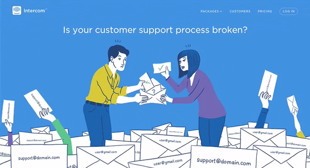
With the use of engaging illustrations, Intercom simplifies the confusing process of email marketing. The to-the-point header draws users in, and the simple scrolling animation implies the actual simplicity of Intercom’s product. This makes visitors keen to learn more, and follow the call-to-action (CTA) at the bottom.
Webflow Nails the Product Story

Webflow is an all-in-one design platform, so nailing its brand story is quite the challenge. This landing page uses gateway panels to communicate its product with features and case studies. As well, the CTA is strong, the credibility indicators below are assuring, and the inline form is simple and easy to fill.
Dollar Shave Club Converts With Imagery
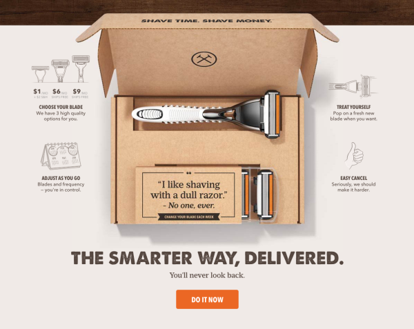
Dollar Shave Club clearly lays out the simplicity of their service, so users get a good sense of what they will receive upon sign up. Using the actual product leaves little for customers to be unsure about, the diagrams layout the details, and the large header draws reader’s eyes to the bottom. Here, the experience is funneled towards the blunt “DO IT NOW” button.
Codecademy Signs Up With Social Accounts
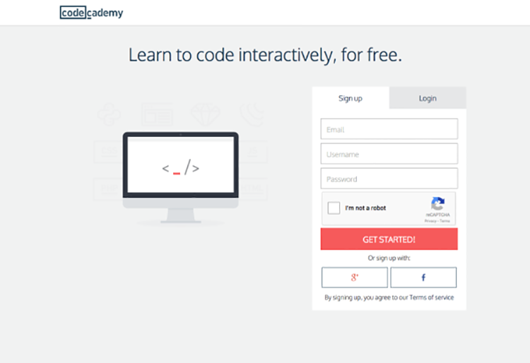
Allowing users to sign up with their social accounts can take the pain out of form filling. Some people will often feel more secure linking their existing accounts than giving out information to another organization. Otherwise, the landing page is simple and tells users exactly what to do.
Type, Photography and UI Unite for Sheer Collective Church
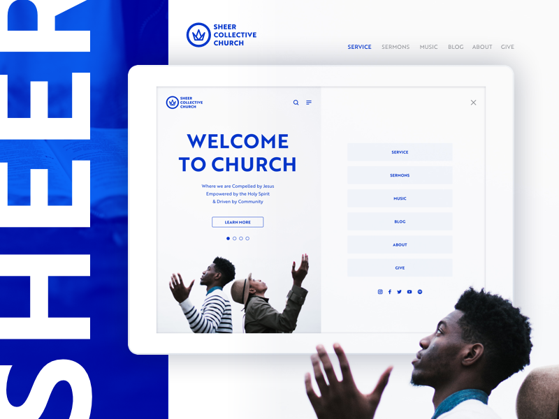
The visual design for this landing page is essential to communicate to visitors that Sheer Collective Church is no ordinary church. The font choice, photography, and branding style each give the sense that this is a new type of institution for a contemporary religious practice. Asking visitors to learn more, rather than immediately sign up is more appropriate CTA for this type of organization.
Operator Does it All in One Page
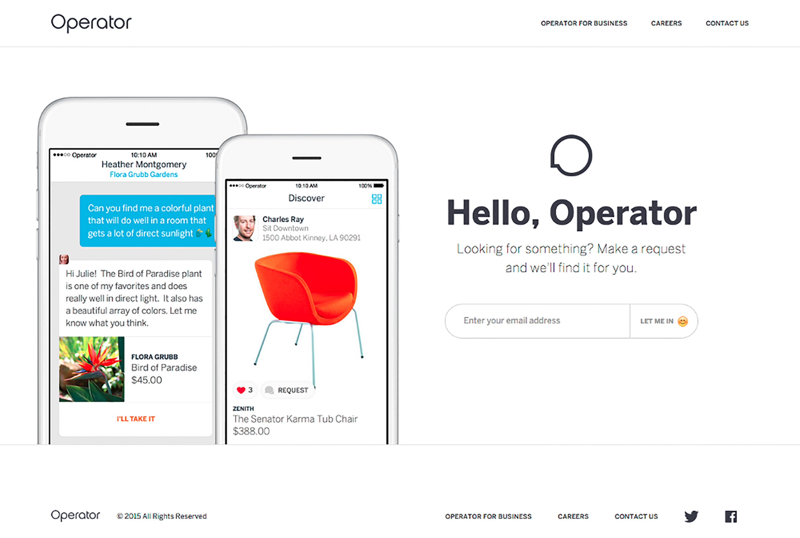
It is a great challenge to introduce an app, communicate its value, call for a download, and all the while maintain visual clarity in a single page. Impressively, Operator manages this feat while still fitting in a full header and footer. They even find space for a friendly emoji to welcome readers.
Swifty Goes Live
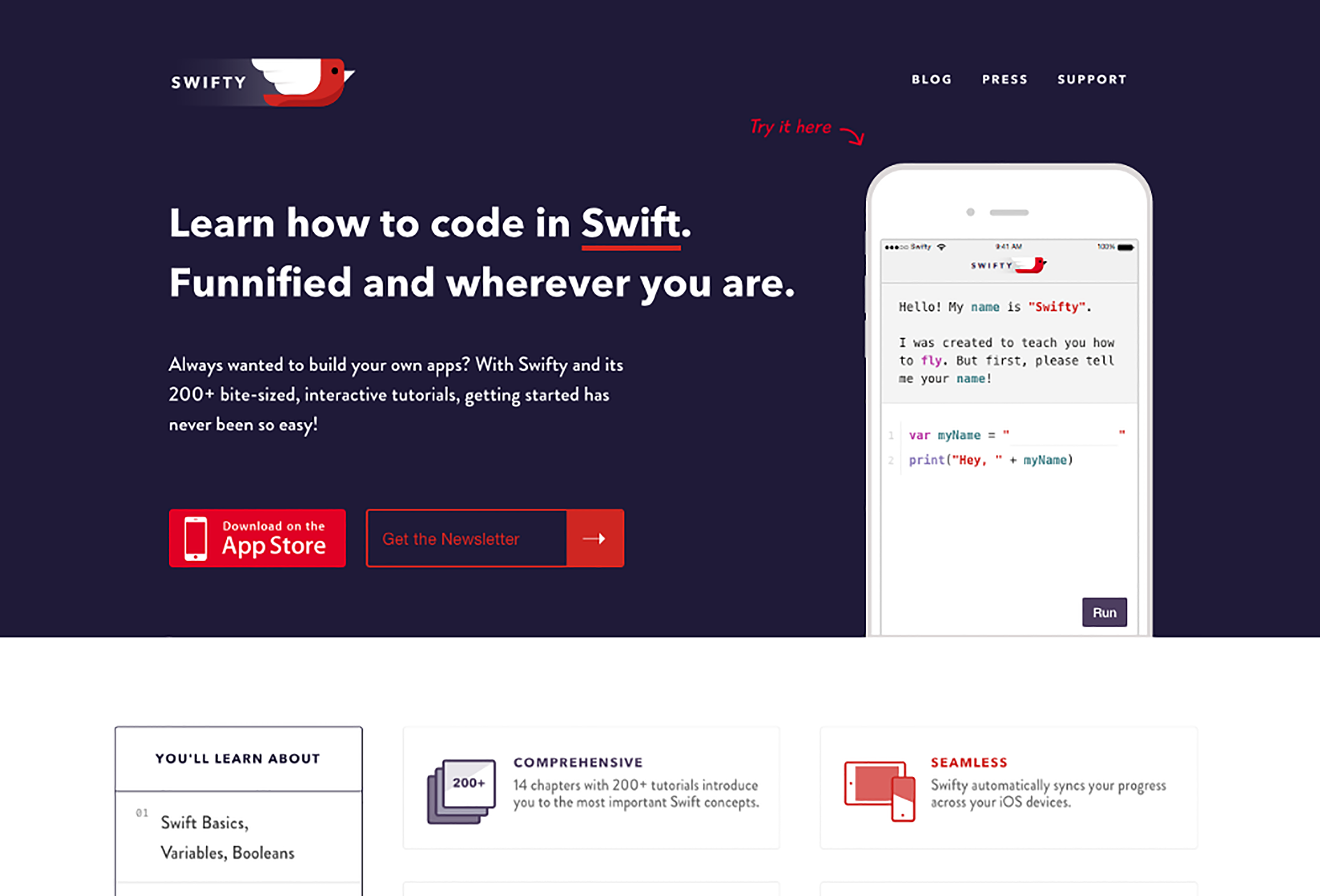
Swifty proves that their product is ready to go with a live demo for users to test on the landing page. The demo includes a quick tutorial to lure users in.
Messenger
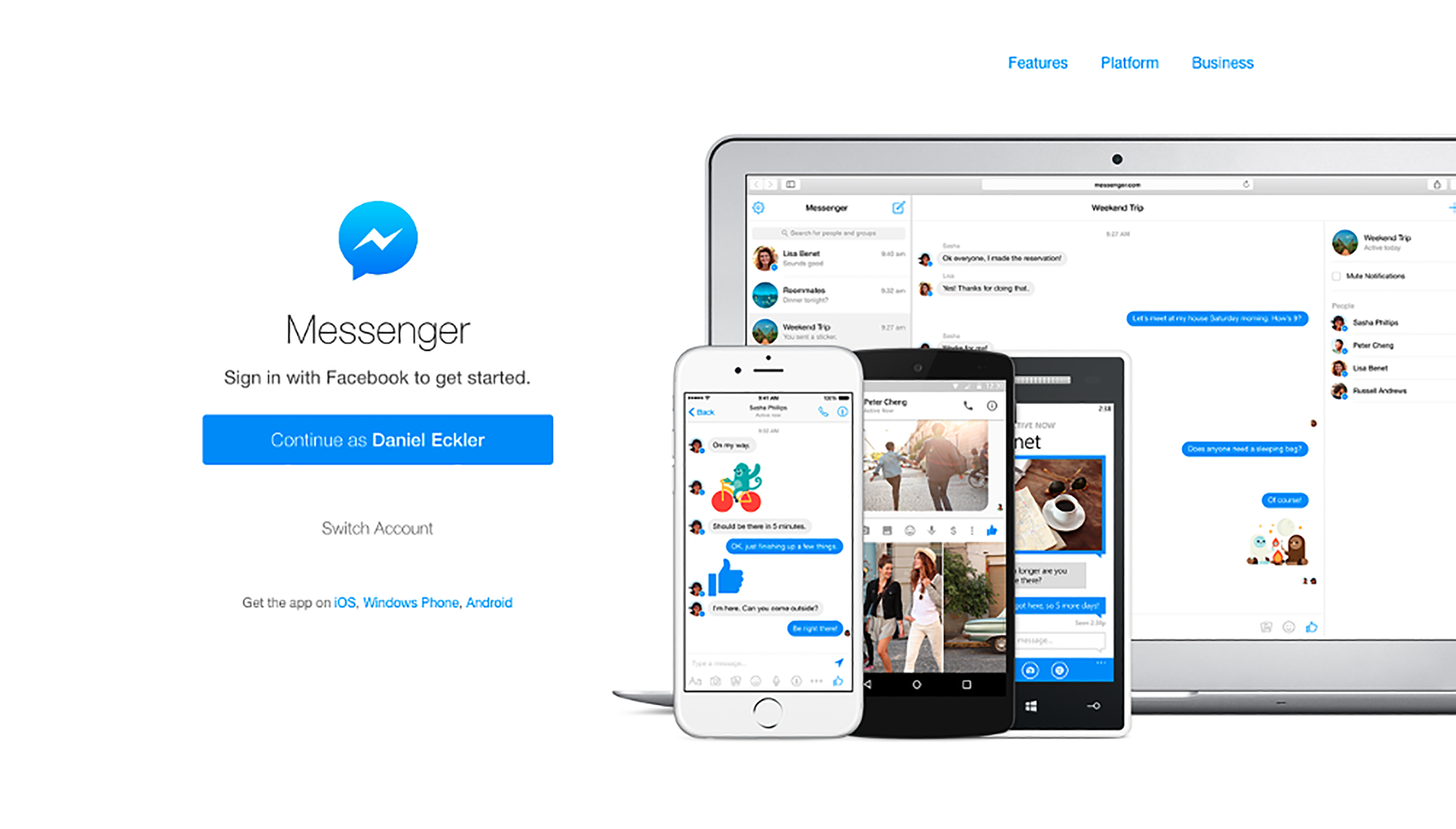
Messenger is one of the most referenced products surrounding the mobile trend for apps to become more than just apps, but cross-platform entities. With its landing page, Messenger shows its ability to work across devices and platforms, displaying that it can work anywhere. Messenger integrates your Facebook log in to personalize the CTA, something that is rarely seen elsewhere, but is incredibly effective. Pretty clever.
Mylo Gives Users a Preview
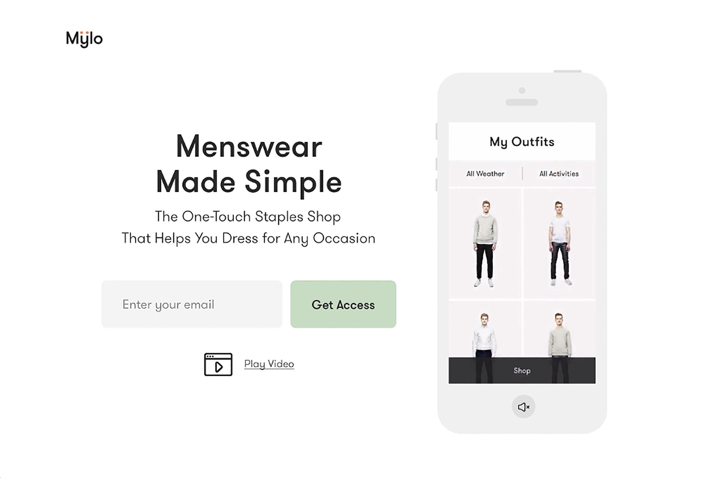
Using video to preview an app is becoming increasingly popular, and Mylo is a great example of how to do it. The video on this landing page plays automatically to clearly articulate the product’s value.
After the big introduction, Mylo uses great photography to convey the brand’s simple living philosophy.
HipChat Knows its Target Market

HipChat is a hosted group chat built for teams. The product claims to supercharge collaboration in real time with chat rooms, file sharing, and screen sharing. With fun illustrations and good copy text, their landing page quickly communicates what types of users they are targeting and how their product benefits them.
Get Converting
There might not be the landing page above that perfectly fits your organization’s or client’s purpose, but that’s because every project requires a nuanced form of communication. But understanding how these pages convert users to fulfill their needs will hopefully inspire you to more efficiently convert yours.